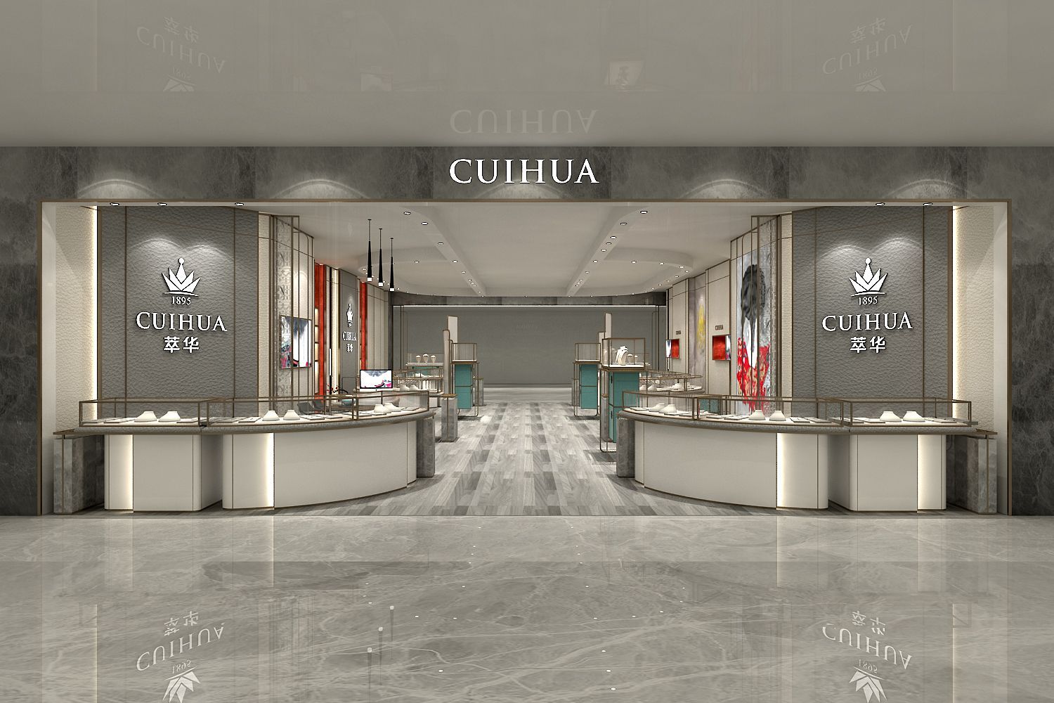
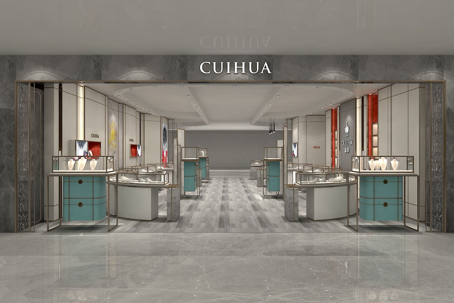
The decoration and design of a jewelry store are crucial as they directly influence the store's image, ambiance, and, in turn, affect customers' shopping experience and purchasing intent. However, many store owners often fall into common misconceptions during the decoration process, leading to unsatisfactory results. In this article, drawing from my years of industry experience, I will explain in-depth the four main misconceptions in jewelry store decoration and provide insights for store owners to avoid unnecessary errors and mistakes.

Misconception One: Poor Space Layout
Space layout forms the foundation of jewelry store decoration, and a well-thought-out layout can maximize the store's space utilization and optimization. However, many store owners overlook the importance of proper space layout during the decoration process, resulting in a crowded and chaotic store interior that negatively impacts customer comfort and shopping experience. To avoid this misconception, store owners should carefully consider the store's size and shape before decoration, planning the placement of display areas, fitting rooms, checkout counters, and customer resting areas to ensure smooth traffic flow, allowing customers to browse and shop conveniently.
Misconception Two: Inefficient Traffic Flow Design
Traffic flow design refers to the path customers take while navigating the store, directly impacting their conversion rate and willingness to make purchases. Unfortunately, some store owners underestimate the significance of traffic flow design during the decoration, leading to disorganized routes that make it challenging for customers to find the products they desire and even get lost. To avoid this misconception, store owners should thoroughly plan the store's traffic flow before decoration, ensuring customers can naturally and effortlessly navigate the store, guiding them along designated paths to increase conversion rates.
Misconception Three: Unclear Visual Focal Points
Visual focal points refer to eye-catching decorations or displays within the store, drawing customers' attention and guiding them to specific areas. Some store owners overlook the design of visual focal points during decoration, resulting in a monotonous and uninteresting store that fails to attract customers. To avoid this misconception, store owners should incorporate eye-catching decorations or displays during decoration, such as unique lighting fixtures, artwork, and jewelry display cases, highlighting key products to enhance visual impact, attracting customers to explore and make purchases.
Misconception Four: Poor Lighting Design
Lighting design plays a vital role in jewelry store decoration, elevating the overall ambiance and image while making jewelry products sparkle. However, some store owners make mistakes in lighting design, such as inadequate or overly harsh lighting, which can affect customers' shopping experience and appreciation. To avoid this misconception, store owners should carefully select suitable lighting types and effects based on the store's overall style and product characteristics, maintaining a bright and comfortable environment while accentuating the beauty and charm of the displayed products.

In conclusion, the four common misconceptions in jewelry store decoration include poor space layout, inefficient traffic flow design, unclear visual focal points, and inadequate lighting design. To create a successful jewelry store, store owners should carefully plan space layout, design efficient traffic flow, set clear visual focal points, and pay attention to lighting design, providing customers with a comfortable, visually appealing, and inviting shopping environment. Only by fully considering these factors can a jewelry store stand out in a competitive market, attracting more customers and driving sales.
+86 19195580698
info@wddisplay.com
+86 19195580698
